Corsair Gaming Strafe Mechanical Keyboard Review
Final Thoughts and Conclusion
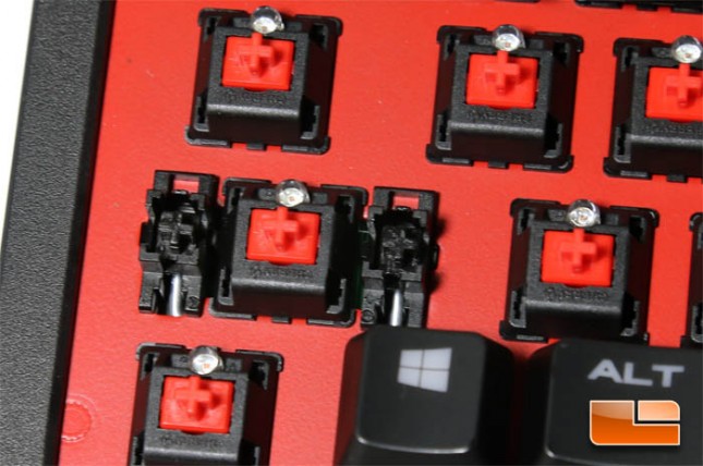
For our closing thoughts, we aren’t going to linger much on the topic of Cherry mechanical switches since those are a standardized part. The Strafe currently comes in two varieties, one with Cherry MX Red switches and the other with Cherry MX Brown switches. The notable difference between the two is the tactile bump felt when pressing Brown switches whereas the Red switches do not. Arguably neither is better than the other and personal choice comes down to preference.
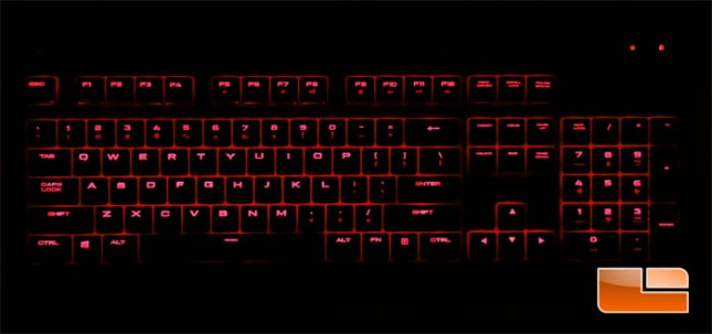
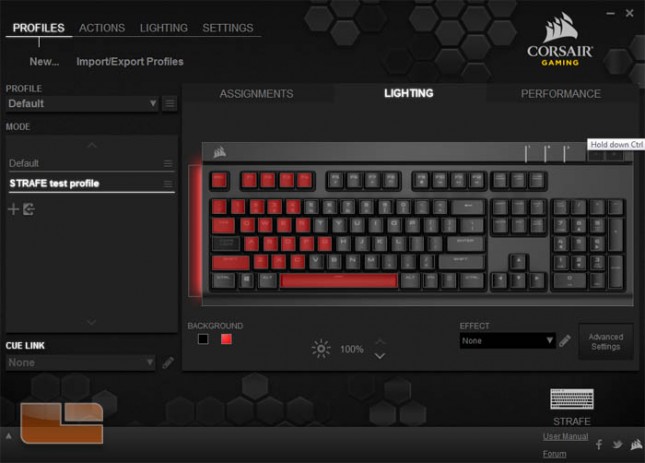
We do see the Strafe has some reduced features when compared to Corsair’s other full layout mechanical keyboard, the K70, namely the lack of dedicated media controls, no usage of exotic materials, and the lack of a wristrest. What’s interesting however are the improved features, namely the full per-key macro customization and the greater number of dynamic lighting effects through the CUE software. The Strafe’s keycaps also have a larger and edgier font that has the effect of allowing more light through the lettering which improves the visibility of the backlighting. Whereas the standard mono color K70 shined brightly because the exposed backplate design allowed light from over 100 LEDs flood out, the K70 RGB the first ever per-key RGB backlit mechanical keyboard ever didn’t shine brightly enough because the keycap lettering was small and limited the visual impact of narrow bands of color. Speculating for a bit, the upcoming Strafe RGB could become Corsair’s better RGB keyboard.
Yet, we do have some concerns with the Strafe. The alternative textured keycap set is nice if that’s your thing, though an optional replacement for the spacebar would be nice too. Regarding the lighting, if the backlighting effect has some sort of brightness fading and the change isn’t fast enough, 8-bit steps in the brightness will be noticeable.
We’ve been comparing the Strafe with the K70 quite a bit obviously because they’re both mechanical keyboards from Corsair. The experience is mostly the same since the mechanical switches are the same. Yet, the differences are there and while the newer Strafe has the design that makes it look like a Corsair keyboard, we can’t shake off the feeling that this product is targeted more to gamers with tackier aesthetic preferences. The K70 was unique in its own right and elegant in ways that it wouldn’t matter if the user was a gamer or enthusiast or neither that exposed aluminum is nice to look at. The prices aren’t too different right now either thanks to a promotion for the K70 this week, $109.99 for the Strafe and $119.99 for the K70 both on Amazon, which weakens the Strafe’s proposition as a more budget friendly option. Instead, we look at two keyboards occupying the same niche, differing in aesthetic and software customization. That’s pretty weird to be forcing such tradeoffs on the buyer, but at least they’re both good keyboards.
Legit Bottom Line: The Corsair Gaming Strafe mechanical keyboard is a somewhat cheaper and less pretty alternative to the K70, but per-key macro customization does give the newer keyboard an edge for gamers who use such a feature.
