Corsair Gaming Strafe Mechanical Keyboard Review
Looking around the Strafe Keyboard
The usage of plastic in the enclosure’s construction, a different keycap font, and the lack of dedicated media controls are the most obvious traits that differentiate the Strafe from the K70. The two keyboards have near identical dimensions and the Strafe is only barely larger, measuring 17.6(L) x 6.7(W) x 1.6(H) / 448 x 170 x 40 mm. The K70 for comparison is 17.25(L) x 6.5(W) x 1.5(H) inch / 437 x 166 x 38 mm. Pay particular attention to the top left of the keyboard where there is the new refreshed Corsair sails logo.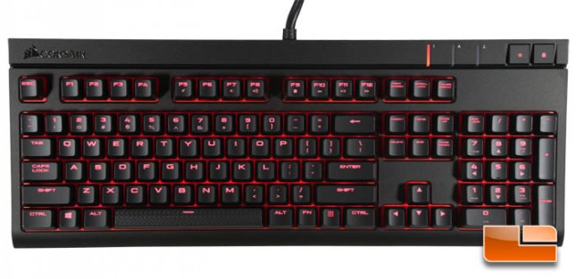
The Strafe has two USB plugs though only one of them needs to be plugged in to power and use the keyboard. The other USB plug is for the USB passthrough on the back of the keyboard.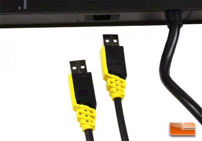
The Strafe does not have dedicated media keys. Instead the F-keys double as media controls when pressed in conjunction with the Fn key.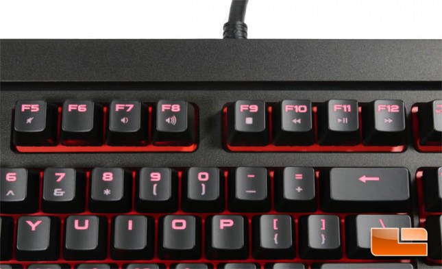
On the top right is the brightness toggle which cycles through four levels and the Windows key lock which glows when toggled on. In the CUE software, the Windows key lock can be configured to additional block Alt + F4 and Alt+Tab.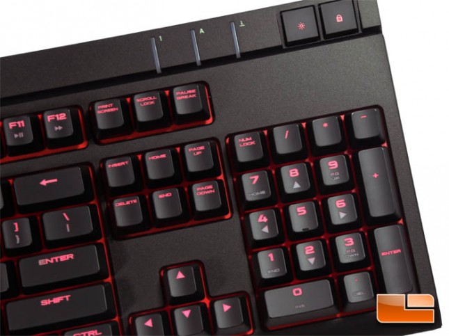
The Strafe features Cherry MX switches in the option of Reds or Browns. Bottoming out on the keypress produces a deep clack sound characteristic of a metal mounting plate.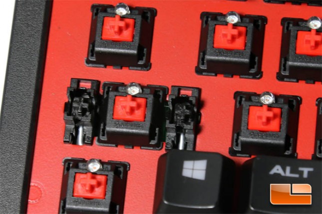
Each switch is backlit with a red LED. The red paint on the mounting plate reflects some of the light to give a leaking effect from under the keycaps. Additionally, the font used on the keycaps is much larger than that used on the K70 which permits more light to pass through the top.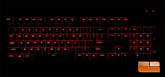
On each side is an active light strip that gives a look reminiscent of the flooding effect of the K70 keyboard.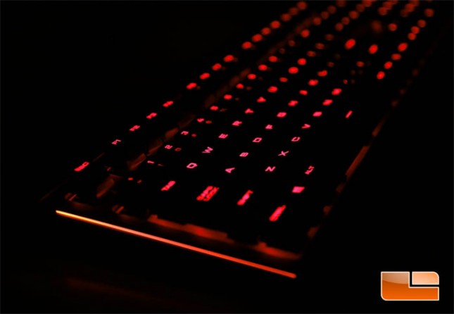
The CUE software allows per-key backlight customization as well as dynamic light effects.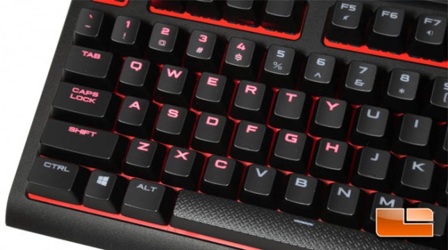
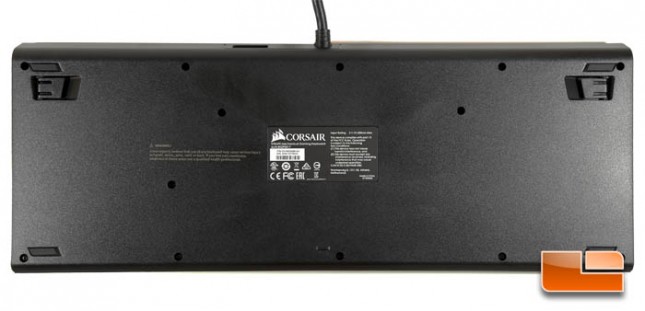
Looking underneath the Strafe we see four rubber feet at each corner as well as two pull out tabs for angling the keyboard.