Windows 8 To Take Desktop GUI Design In a New Direction
In a rather long blog entry in the Building Windows 8 blog, Microsoft goes through the history of Windows Graphical User Interfaces (GUI), going all the way back to Windows 1 in 1985 and ending with the upcoming Windows 8 GUI. They explain the new direction that they’re going with Windows 8, calling Vista’s Aero Glass look “dated and cheesy”, with Windows 7 toning all this down significantly, along with the use of flat icons as opposed to Vista’s 3D ones.
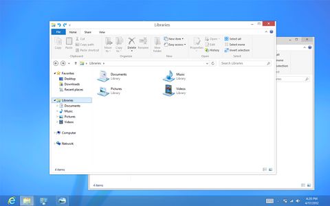
For Windows 8, they’re getting rid of the rounded window look and going for a smart, square-edged look instead – this will be better for windows screenshots if nothing else, which will be free of the corner “ears” that Aero Glass screenshots have. They will also be getting rid of the transparancies still visible in Windows 7, the glows and gradients found on buttons etc, with a default look of an overall white to create an airy and premium look.
Personally, the one thing I really liked about the much maligned Vista was its Aero Glass GUI, with its smart-looking black shine, transparent glass effects and stylish 3D icons, all combining to give it a serious wow factor. It still has it for me to this day, in fact. Had Vista been a better product overall, perhaps Microsoft would not have felt so compelled to move away from its impressive GUI? We’ll never know.

We applied the principles of clean and crisp when updating window and taskbar chrome. Gone are the glass and reflections. We squared off the edges of windows and the taskbar. We removed all the glows and gradients found on buttons within the chrome. We made the appearance of windows crisper by removing unnecessary shadows and transparency. The default window chrome is white, creating an airy and premium look. The taskbar continues to blend into the desktop wallpaper, but appears less complicated overall.
To complete the story, we updated the appearance of most common controls, such as buttons, check boxes, sliders, and the Ribbon. We squared off the rounded edges, cleaned away gradients, and flattened the control backgrounds to align with our chrome changes. We also tweaked the colors to make them feel more modern and neutral.

Comments are closed.