New ‘Frustro’ Impossible Font Comes to Life
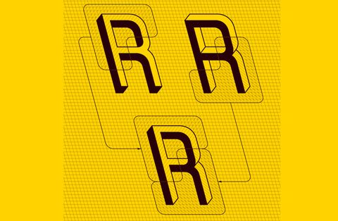
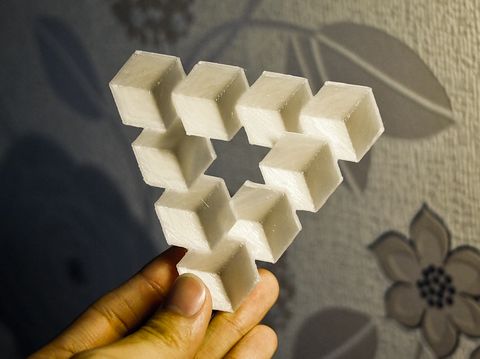
There’s a new font in town designed by Marti Hegedus, quite aptly named Frustro and looks really cool. Why is that? Because it’s built on the principles that constructed the impossible shapes drawn by M C Escher and Oscar Reutersvard. These drawings are famous in their own right, but mathematician Roger Penrose has made impossible shapes even more popular by designing other objects using the same principles and showing them to the world, describing them as “impossibility in its purest form”. Look carefully at the Penrose triangle below in the photograph. Doesn’t look quite “right” does it? Now, the cynical might imagine the already difficult-to-read back of a contract written in a Frustro font to discourage people from actually reading it, even further…
This font will be made available for general use, but it’s not clear when that will be.


The font, named Frustro, takes the top left and bottom right portion of each character from a 3D typeface and combines them into an equally impossible result that seems to be facing two different directions.

Comments are closed.